定义CustomControl
CustomControl就是一个普通的twinBASIC类,带有一些额外的属性和要求。
TIP
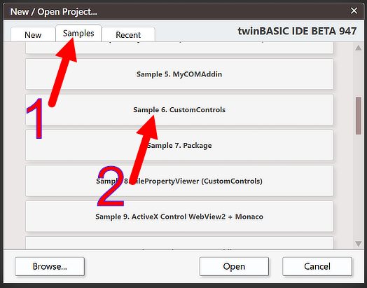
强烈建议在尝试实现自己的CustomControl之前,先查看并实验twinBASIC提供的示例项目。
CustomControl()属性

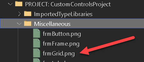
这是所有CustomControl的必需属性。你必须提供项目内图片文件的相对路径,用于在窗体设计器工具箱中标识你的控件。我们建议将图片文件放在项目的Miscellaneous文件夹中。
ClassId()属性

这是所有CustomControl的必需属性。你必须提供唯一的CLSID(GUID),以便窗体引擎与你的控件配合工作。
TIP
如果你输入 [ ClassId () ],twinBASIC会帮助你——只需点击"insert a randomly generated GUID"文本:

COMCreatable()属性
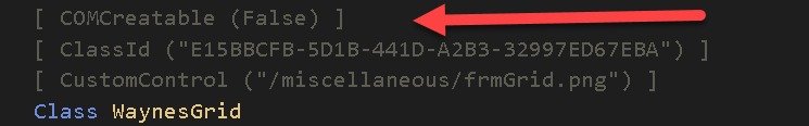
这是一个可选属性,但通常建议将此属性设为False,因为你不需要从外部COM环境实例化CustomControl。
必须实现ICustomControl
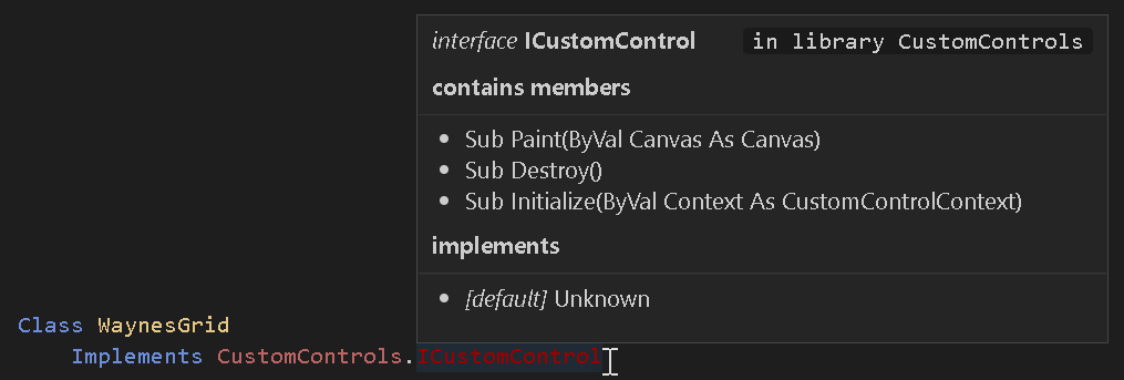
所有CustomControl必须实现CustomControls.ICustomControl。该接口当前有3个你必须实现的方法:
Sub Initialize(ByVal Context As CustomControlContext)此方法在你的控件附加到窗体时调用。你必须将提供的Context对象存储在类字段中,因为它提供了一个 Repaint() 方法,用于通知窗体引擎控件中的某些内容已更改并需要重绘。
Sub Destroy()此方法在你的控件从窗体分离时调用。这提供了打破循环引用的机会,以便你的对象实例可以正确析构。如果你不在对象中创建循环引用,此实现通常可以留空。
Sub Paint(ByVal Canvas As Canvas)这是CustomControl最有趣的部分。因此它有自己的章节,参见绘制/绘图到你的控件
最小属性集
由于twinBASIC尚不支持继承,你必须为所有CustomControl暴露一组公共属性(类字段):
Public Name As String
Public Left As CustomControls.PixelCount
Public Top As CustomControls.PixelCount
Public Width As CustomControls.PixelCount
Public Height As CustomControls.PixelCount
Public Anchors As Anchors = New Anchors
Public Dock As CustomControls.DockMode
Public Visible As Boolean窗体设计器和窗体引擎使用这些属性,因此将它们包含在你的CustomControl类中很重要。这里使用的类型都在框架中定义:PixelCount、DockMode和Anchors样式对象。
注意,窗体设计器使用的是未经DPI缩放的像素值。因此你的控件的Left/Top/Width/Height属性不反映DPI缩放。例如,如果你的控件宽度为50像素,则在DPI 150%时,实际绘制宽度为75像素(参见绘制/绘图到你的控件)。
必须有序列化构造函数
CustomControl必须提供序列化构造函数:
Public Sub New(Serializer As SerializationInfo)传入的Serializer对象提供了一个 Deserialize() 方法,你调用它来加载通过窗体设计器为控件设置的属性。更多信息参见属性表和对象序列化。
INFO
当前框架将序列化器类型命名为SerializeInfo(不是 SerializationInfo),Deserialize() 暴露为 RuntimeUISrzDeserialize()。参见参考页面了解当前成员名称以及该对象上也可用的设计模式/运行时模式标志。
另见
- CustomControls包参考 —— 框架部分(接口、回调对象、
Canvas绘图面、SerializeInfo序列化器)和基于其构建的内置Waynes…控件的完整参考。